The idea behind the continuity of design is a complex thought embodied in a simple philosophy. It focuses on connecting different elements of a design in such a way that it looks as one individual entity, rather than different parts showing their own individuality.
Let's break it into a really simple definition.
The philosophy of continuity is strictly about matching elements. This means that colors, fonts, imagery, layouts, etc. of a design should be consistent enough to establish a clear connection between the whole project. For example, in logo designing processes, it’s important that colors do not change from piece to piece without a specific reason as it breaks the continuity of the design and final project may look disoriented. In a blog posted on Designhill, writer John Kash reveals that every piece, every element in your graphic design must compliment the identity of the brand rather than being there for the sake of looking pretty.
This is perhaps one concept that is highly studied and strongly believed by a fair share of psychologists across the globe. Now, does that mean a psychologist can judge the aesthetics of designs better than designers?
There answer is no! However, there is always more than what meets the eyes.
Let's now discuss about the continuity of design once more before finally starting the debate.
In a more elaborated sense, continuity doesn't come just from physical appearance of the design, but it comes from the idea and meaning behind each element used in it. If one element is designed with rough edges and drop shadow around it, and the other is with sharp edges having a flat design, the relationship won't be much relevant to the design project as a whole making the entire campaign look ill-designed.
Are Psychologists Better Designers?
Leonardo.info reveals that Czech-born psychologist Max Wertheimer was fascinated by the resemblance between the flashing lights at a railroad crossing and the lights encircling a theater marquee.
This perhaps could be termed as the beginning of first design.
This path-breaking observation led to few sets of descriptive principles that determine how people visually perceive objects. These principles are surely the Holy Grail for almost every designer who deals with graphics, illustrations and flash objects.
Let's explore these design principles.
1. Principles of Gestalt
If you have seen any good design in recent past, chances are it is based on the principle of gestalt. That's because most designers understand that almost all design principles are the branches of gestalt theory.
“The whole is greater than the sum of its parts.” — Kurt Koffka
The above quote aptly explains the complex Gestalt theory in a simple, precise and concise manner
Check out the image below to know the various aspects of Gestalt theory.
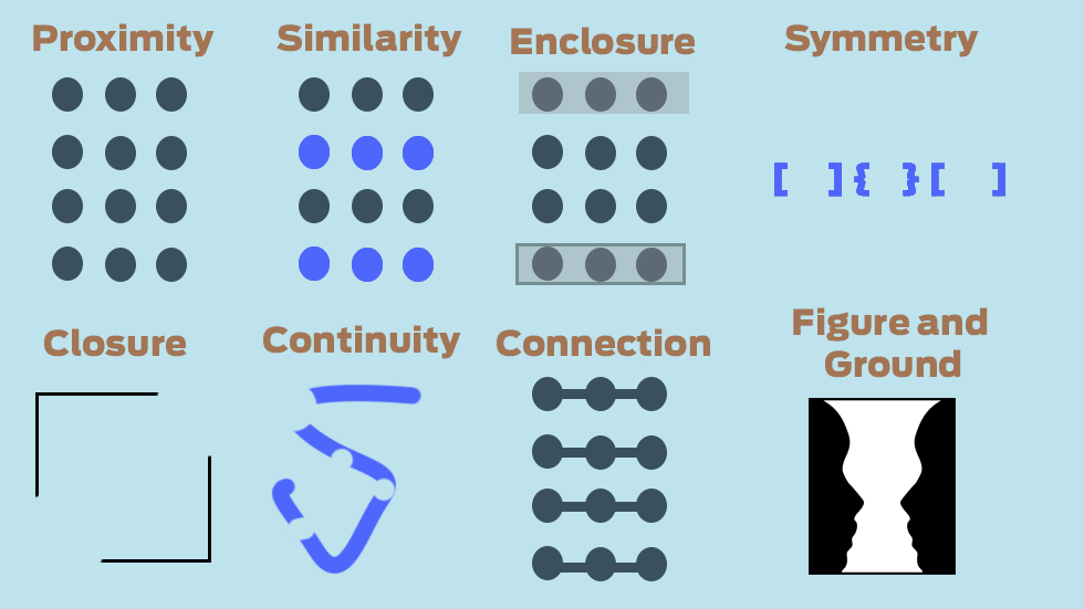
One needs a little exploration in the world of psychology to understand that the worldly illusion that’s created within the human mind from time to time. As it is evident from studies, our brain is habitual to make assumptions in order to satisfy and assure our observation about the world.
Creative Bloq reveals that the Gestalt principles, in terms of design, describes the way our brain establishes unification or relatedness to visual elements based on proximity and white space. For example, design elements that are close in proximity are perceived to be in a relation even if the opposite is true. Same way, similar objects appear to be related; and objects having asymmetrical resembles appear to be unrelated. The underlying fact of the matter is that users are somehow going to a find a meaning in a design on the basis of proximity, grouping, similarity and continuance even if there isn't any.
One reason why psychologist understand the impact of designs more than designers themselves.
2. Occam's Razor
Occams's Razor or the law of Parsimony, is the brainchild of William of Ockham. This principle is basically a problem-solving theory. Now how does it fit into the realms of design?
“A designer knows he has achieved perfection not when there is nothing left to add, but when there is nothing left to take away.”– Antoine de Saint Exupéry
This quote sums up the Occam's Razor in as few words as possible.
Britannica.com explains Occam's law as the simplest solution is almost always the best. This is, again, something which is almost the unsaid rule in the designer community across the globe. With the flexibility of chaotic design tools of today, it is quite easy to get carried away. In fact, it wouldn’t be an exaggeration to say that as a side effect of overlooking Occam's Razor in terms of web-design, a designer may end up designing a complicated site that may have a lot of functionality and information, but is difficult to use, build and maintain, actually defeating the purpose of creating the site. Though the designer might think that his/her design will not fail to impress, it actually will accomplish a lot less.
This goes true for all kinds of designs as well. In the hope of dispensing a lot of information in design works like logo design, clothing design, stationary design, and mobile app design companies tend to stuff up the design with things more important than the aesthetics of the design itself. It has been said that majority of users only access 20% of the content/design in one look. In fact, designers Henna Ray explains in one of her blogs that simple design makes brand symbol effective and communicating.
3. Dual-Coding Theory
Look at the example below:
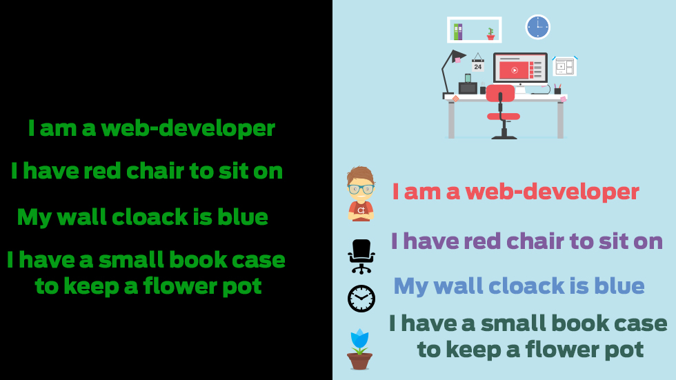
Both the versions have the same content. But what do you think will be easier for you to understand and remember? The second one, right? We’re sure you’re nodding your head in a yes! Now, why is that? Let’s explore the Dual-Coding Theory and understand why.
Devised by Allan Urho Paivio, who was an emeritus professor of psychology, Dual-Coding Theory stresses on the fact that formation of mental images aid learning, which is basically the underlying principle of all designs across the globe. Instructionaldesign.org sates a quote from Paivio (1986) that aptly describes the mechanics of the Dual-Coding Theory. "Human cognition is unique in that it has become specialized for dealing simultaneously with language and with nonverbal objects and events. Moreover, the language system is peculiar in that it deals directly with linguistic input and output (in the form of speech or writing) while at the same time serving a symbolic function with respect to nonverbal objects, events, and behaviors. Any representational theory must accommodate this dual functionality."
In spite of its high relevance in the field of Instructional design, it has hardly been used by graphic designers across the globe. The relationship between memory and learning through verbal and non-verbal channels has amused philosophers and psychologist alike. The key point is this; people learn and remember best when the stimuli is both verbal and image based. In today's static content based web communications, introducing Dual-Coding is a grand leap of faith.
That's one reason why infographics have such a staggering success rate associated with them and the reason why interactive content is so popular amongst designers, businesses and content marketers. An article by designer Jelly Shah reveals that the information that’s usually boring and dry also becomes interesting and shareable when incorporated in infographics.
Conclusion
In the beginning of the article, we discussed how the continuity of the design has been developed and sharpened over the period of time by many psychologists taking keen interest in its growth and evolution. Now, this doesn't mean that psychologist are better than designers. A psychologist is always interested in the final cause of the effect, whereas designers are habitual to change the cause depending upon the effect.
However, in due course, we will witness a design community that focuses more on the maxims of the ancient psychological principles, rather than the usual ''It will look pretty'' guidelines when conceptualizing and creating a design.
[Image Courtesy: Designhill.com]