Go back to your childhood days and recall the memories of reading story books. What do you remember the most about those books? “Pictures, of course!” you would say. On any given instance, we are more inclined to go through pictures, graphical representations and tables as compared to literature. And that is why, it is more fun to explore information through infographics. As the name Infographic suggests, it is a graphical representation of information.
Now, if you are a business owner willing to provide complicated information to your customers, how would you do that? Blog Post? Few read that. Whitepaper? Too technical! This is where infographic comes to your rescue. Infographics convey all the information you want in the simplest way to your audience. Moreover, with so much of content on the internet; visuals will help you stand out from your competitors. But do not just go about creating infographics without knowledge. ‘Coz, if you do that, it might turn out to be an overwhelming graphical mess!
Fasten your seatbelts, as we bring to you 10 graphic design tips that will help you create infographic that go viral:
1. Know Your Story
Presentation of infographics is just like telling a story. And you must know how to narrate that. The perspective with which you decide to tell your story will help you decide what information the infographic should have. Also, remember that infographic should have minimal content and more of graphical representation. Make the layout of your infographic in such a way that it displays the theme of your concept and effortlessly communicates your idea to the audience.
Let us say, you are creating an infographic on “Product Personalization Trends Over the Years.” You can create a graphical timeline along with pictures to acquaint your audience with the evolution of Product Personalization. In short, find your narrative and you will be able to express yourself better!
2. Use a Wireframe
So, let us assume that you have gathered the data you need and you know the story. The next step calls for you to create a hierarchy or flowchart. Feel free to do it in your book or on your device. Thereafter, you need to work with the designers to create a wireframe. An ideal thing to do while creating infographic is to use a grid system for creating margins. When you keep enough space in between different elements and the edge of your canvas, it keeps visual tension at bay.
You can also conduct research on different infographics and choose a wireframe you like the most. In case you do not know how to create a wireframe, share the design with a company or designers who provide professional web design services. They will ensure that they display your information in a better way.
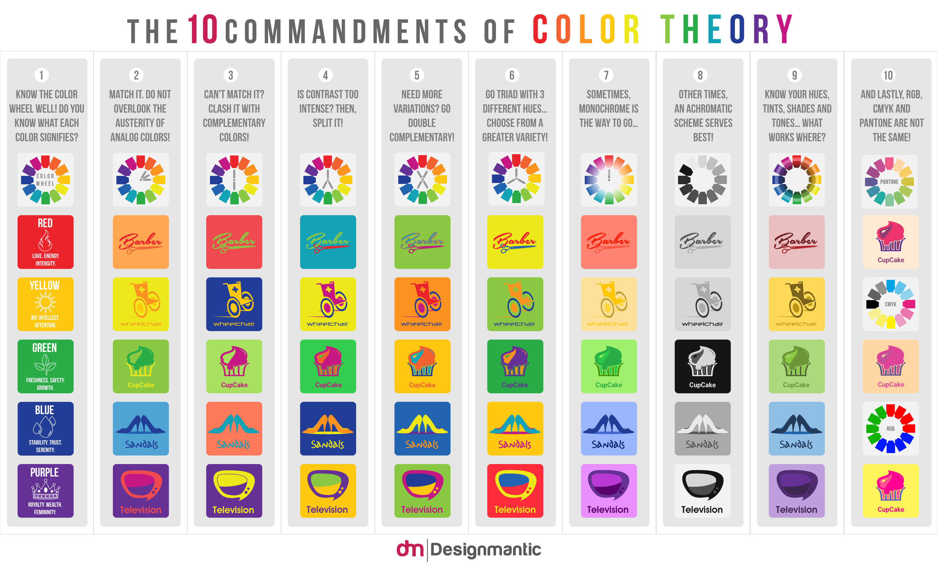
3. Choose the Color Schemes
The type of color you use for your infographic depends on the theme you are going with. If it is a business infographic, you should ideally go with neutral colors like green, blue, grey or your brand color. In case of a funny or comic infographic, go with brighter or neon colors. But make sure that the colors are not too loud as they can be blinding for the eyes. And you do not want to drive your visitors away.
https://www.designmantic.com/blog/wp-content/uploads/2014/05/Color-Theory-Infographic.jpg
The best thing to do would be choose 3 major colors and try to stick to them. Feel free to use minor color shades that are compatible with your primary colors. You can also create blocks of neutral colors in your infographic so that it gives a breathing room to your views.
4. Decide the Length
Infographic is not a visual catharsis of information. You do not have to dump all the data you have in one place. The information should be crisp and have a series of facts presented in an interesting way. Do not make your infographic too long. An ideal width for vertical infographics is 600 to 1100 pixels. A long infographic does not work when the connection is slow. Moreover, the reader cannot keep scrolling endlessly.
The team of researchers, content and design creators should work together and decide on the size and length of an infographic. Only then, they will be able to render a good user experience.
5. Work on the Typography
A good infographic is the one that expresses itself mostly through visuals. And the text in it takes the backstage. But at times, images and graphics are not enough to express you want to say. This is when you would need to use the text. However, there should be a limit to the amount of content you use in your infographic. Once you decide on the limit of number of words, make sure that your typography is legible for your audience.
If you are using small text, keep it short and increase the length of it so that it is easy to read. There is no need to keep the same font throughout infographic. You can take flexibility with it. Strike a perfect balance with two different types of fonts for headings and subheadings to create a visually appealing hierarchy.
6. Select the Chart Type
Deciding on the chart type is a crucial when you want to convey your data in the right way. But before you do that, you need to mull over certain questions. What is the type of data you want to represent? Are you making a comparison between different data types? Are you representing a trend over the years or an outlier? Once you find an answer to these questions, you would know whether to use column graph, bar graph, line chart or bar chart.
Remember, you do not have to cling to the above-mentioned graph patterns. If you feel that you can represent information in any other way, go ahead and do it.
7. Cite Your Sources
Plagiarism is a serious offence. And you possibly do not want that kind of blame. For making your infographic look authentic, you must cite the resources. If you do not want to occupy too much of visual space by citing each resource at the end of every image, you can put the resource links at the end of your infographic.
By citing the resources, you can provide more data to your users enabling them to explore information. It is always advisable to use statistics and information that is recent. Old data is not reliable.
8. Optimize for Sharing
What is the end goal of sharing an infographic? Of course, to drive traffic. And that is why, we usually embed the infographic with a blog post and share it on social media. Before you start sharing, optimize it and add social share buttons to your post. This ensures that more people read it and share with others.
Responsiveness is very important if you want to enable your visitors to read your infographic on their devices. Optimize it so that it keeps inconvenience of reading and sharing at bay.
9. The Testing Phase
Once you come up with the final design of the infographic with all the content, data, and graph in place; the testing phase begins. Share the infographic with all the experts of your team to ensure that the infographic is legible and easy to understand. Next, ensure that it goes with your brand and the message you want to convey. Keep evaluating the infographic design until it becomes easy to read and decipher.
If possible, share the infographic with third parties and consider their feedback. Make the necessary changes and make final changes to it before you release it.
10. Share It
Sharing is just the beginning. There are several aspects responsible to help your data to rank on Google. So, once you publish the infographic, open doors for discussions, questions, and comments. As and when people give their inputs, you can note the points and keep them for future reference. Also, when you discover new data, you can create revisions of the infographic.
It can be a little distracting when you need to leave your current projects and focus on making infographics; but at the end, it is worth it!
Infographics are a very powerful marketing tool. So, make sure that you use them in the right way. We hope the above 10 tips will help you to create an infographic that is worthy of going viral. All the best!