Mobile marketing has become a strategic and effective way to generate leads and increase sales. The question is, do you integrate mobile SEO strategies for your business?
When there are more mobile phone users than internet users, you will be missing a lot of you concentrate on web marketing. Internet users number at around 4.54 billion, with a 59% penetration in the global population.
However, mobile phone users number more than 5.19 billion, with 67% penetration of the worldwide market.

As a result, Google algorithms now accommodate mobile SEO even for desktop search. If you are not creating meaningful mobile experiences to go hand-in-hand with your SEO strategies, then it affects your SERP ranking.
Mobile SEO Defined
Mobile SEO is the search engine optimization of websites that integrate with flawless viewing on mobile devices like smartphones and tablets, running on at least one of these three configurations:
· Responsive Web Design: your site and its contents can adjust to different mobile devices without changing the HTML code. No matter what size of the user’s screen, display settings will change without distorting your content.
· Dynamic Serving: depending on the user’s device, the server responds on the same URL with different HTML and CSS codes. Valid headers instruct the browser how to display the contents and help Googlebot figure out that a much quicker mobile content is available for your website.
· Separate URLs: This configuration allows the effective display of your web content on multiple mobile devices. For every screen size, each URL is fitted with a different HTML code.
Optimizing the content in search engine results pages ( SERPs) is the method of getting higher placement for your web pages. This method lets you boost organic traffic from search results. Google outranks other search engines because it holds 95% of the mobile search market. So web developers optimize for Google, first and foremost.
Since mobile SEO is the strategy of site optimization that ensures your content looks great and functions flawlessly on mobile devices, it provides a positive and meaningful mobile experience for your users. Because your content looks great regardless of the device or screen size, It creates a seamless interface whether users are on a laptop or moving to their smartphone or tablet.
Digital marketers and web developers are now keen on the fact that 76% of consumers shop on mobile devices. When your site is not mobile-friendly, it decreases your SEO ranking and user satisfaction of your customers or subscribers. 52% of users engage less brands and their sites because of a bad mobile experience.
So how do you create meaningful mobile experiences that boost your SEO? Here is how.
Creating Positive Mobile User Experience:
- Speed Up Your Site
Google reports 53% of visitors leave if pages take more than 3 seconds to load. Moreover, half of the users expect a loading time of about 1-2 seconds only. So, it should be a top priority for your SEO team to make sure the mobile page speed of your site is phenomenal. You can check Google’s mobile speed test to check for any speed problems.
When your load time is fast, it creates a positive mobile experience you’re your users on-the-go. They can quickly access your site even if they are on mobile data or connecting to public Wi-Fi. When your load speed is optimal, you keep your bounce rates low and your dwell time high, which increases your SEO.
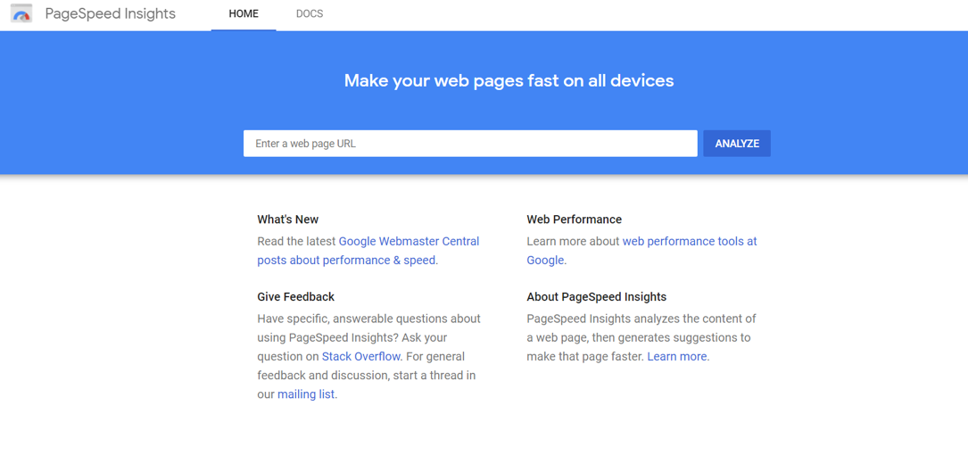
Through the Google PageSpeed Insights tool, you can see where your site is optimized and where it needs improvement. Google will provide recommendations to improve load time for mobile users.
You can get third-party page speed services from a digital marketing company so you can have experts improve your page’s load time. You can again hire your web developer. It will be better and more cost-efficient for your business. The moment that loading time issues spring up, it can be resolved right away since you have dedicated experts looking after your site or sites only.
- Integrate a Responsive Design
A responsive site is a site where interface features adjust for every device and screen size to give users a better visual and surfing experience. Google provides responsive web design guidelines for web developers to follow if they want to make responsive sites.
Integrating responsive design makes it easier to browse your site. Users can quickly scroll through your page and view your site correctly.
Without responsive design, you’ll push more leads away. If users cannot quickly view and read your content, they are unlikely to dwell on your site.
- Create a Seamless Experience
Since people are more mobile, their consumption of content shifts from desktop to mobile devices routinely as well. But regardless of what devices are in use, users expect consistency in their user experience whether they access your site from a desktop or a mobile device. 63% of users expect mobile responsiveness, but only 42% say they experience mobile responsive sites.
- Use Mobile-Friendly Pop-ups
Specific actions can cause a screen pop-up. That could be when someone first visits a page, scrolls to a certain section of the website, or even moves their mouse back to the search results. Effectively, pop-ups help grab the audience’s attention and make them look at the important details you want to share.
If you are doing content marketing and need to include promotions, lead magnets, and the like, do so without incurring mobile intrusive interstitials penalties by Google and being blocked by Chrome adblocker. You also risk annoying your mobile visitors if your pop-ups and ads are hindering their viewing experience. You even risk losing customer trust if all they can see while browsing are pesky ads and pop-ups.
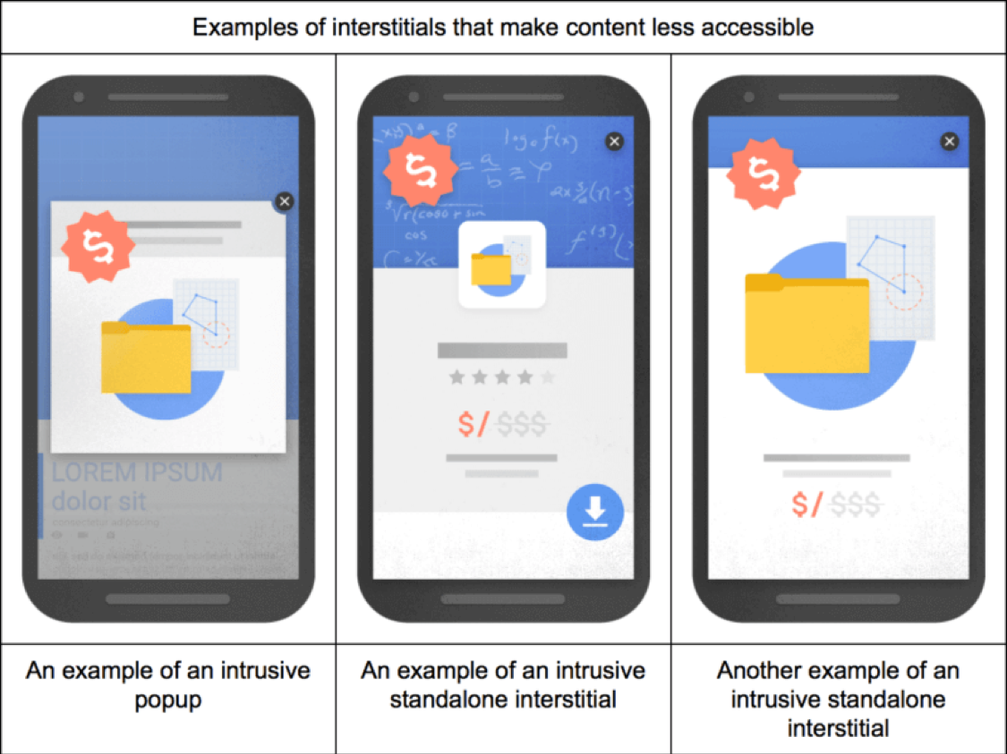
Use the right WordPress tools that let you run content marketing campaigns without ruining the mobile user experience. Make sure the pop-up shows a simple way to exit out of, like a noticeable “x” at the top.

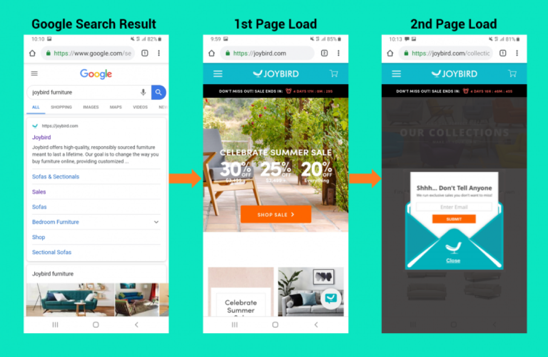
If you want to boost your mobile SEO, create mobile-friendly pop-ups on your website. Here is another example of a mobile-friendly pop-up by SiteKit.
5. Mobile Content Optimization
Optimize your site content for mobile visitors as it is one of Google’s top three search ranking factors. You need an excellent content strategy, like compelling headlines, LSI keywords and keyword intent, inbound links to increase authority and relevance, avoiding thin content, and instead of creating high-quality content instead of at least 2000 words.
6. Optimize Local SEO
Local SEO is essential for mobile SEO. User search for local businesses is increasing because it is more accessible to users. Users include phrases like “near me,” “open now,” and “where can I buy” whenever they search for a product or service. It is then best to adapt your SEO strategies to include local SEO.
Start with integrating local keywords. If you are a bakery owner, for example, that suddenly shifted from a brick-and-mortar store to an online business during the pandemic, it includes words such as “freshly baked pastries in Kelburn, Wellington.” Doing so enables you to appear on search results for “bakery near me” or “bakery in [city].”
Local keywords help you appear in more local search results and is an effective strategy to help you boost your SEO.
7. Mobile-Friendly Navigation Bar
Your navigation plays a crucial role in locating and getting information on your site. Even your navigation bar needs to be mobile-friendly. If the interface is complicated to use, users may get annoyed and leave. Create mobile-friendly navigation so users can continue browsing your site without obtrusions such as navigation bars covering their entire screen.
A hamburger menu is a perfect way to construct mobile-friendly navigation. Hamburger menus appear at the top of the three-line list. Users pressing this button would see a drop-down menu for all the various sites they can see.
A hamburger menu keeps navigation simple and not cumbersome for your users. It also keeps your site clean and helps your audience find information easily.
8. Optimize Title Tags and Meta Descriptions
Your title tags and meta descriptions are essential to mobile SEO. These two factors decide whether anyone clicks on the search results list. When mobile users search for information easily, they also use your title tag and meta description to decide whether they can click on your page.
· Title Tags: These tags tell your audience what your page covers.

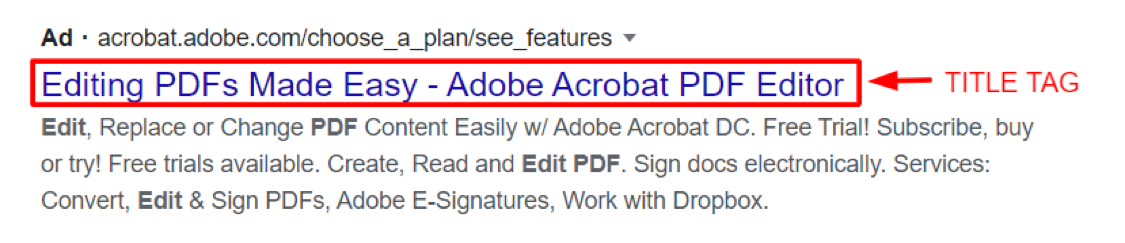
· Meta Description: it is the short blurb users see after the title tag. Your meta description includes an overview of your website. It helps users decide whether your page is important to their search query. You’ll get more web users to click on your link if you have a concise but compelling meta description.
For example, this meta description regarding “best pdf readers in 2020” has a short but informative meta description that gives readers a clear picture that they will know 8 of the best pdf readers when they click the site.

9. Create a Separate Mobile URL
To optimize a website for mobile, web developers may create a different mobile URL. It means they create a parallel site for mobile users. Doing this allows developers to build a customized experience specifically for mobile users.
A mobile URL can appear as “m.website.com” or “website.com/mobile.” When users access your site through a mobile URL, they get to experience a site version specifically adapted for mobile devices, maintaining a positive user experience.
10. Create Mobile-Friendly Content
Creating mobile-friendly content means you format your content to provide a positive experience even if users access your site through mobile devices. Make your site navigable so users can conveniently scroll through pages.
Keep paragraphs between 2-3 sentences, so it is more readable, more accessible, and more comfortable for users to skim through your content.
When adding photos and video content, make sure You’ll they will not slow your page down. Optimize both images and video to maintain optimal site performance.
Adding images and videos make your material interesting more engaging, but if they are not optimized (like the file size too large or the video is too long), then it can bring your SEO down.
If you have a mobile app, it increases engagements even further, because your users can access your site’s contents even when they are offline. You can funnel content from both web and mobile to your mobile app to keep users engaged, connected, and converting.
Conclusion: Create Positive Mobile Experiences to Boost SEO
Mobile responsiveness should be the norm nowadays, especially since more people are on their mobile phones and other devices. Creating a good first impression is critical so that users will come to your site for more.
It sets your site apart from the competition when you have excellent site UI/UX, especially one that stays excellently functioning even on mobile. Mobile responsiveness is something that you need to watch out for if you want to create meaningful mobile experiences that boost your SEO.