A color scheme is a central tool in building a strong brand image, but believe it or not, choosing a color scheme isn’t as simple as it might seem. Unfortunately, we don’t recommend just plucking a couple of colors out of thin air!
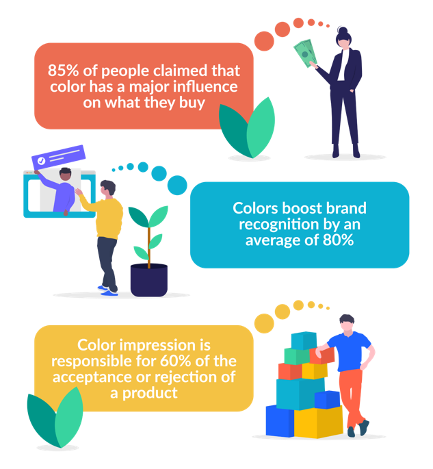
Psychology plays a large part in how we view brands. The colors used in a logo or other marketing materials can boost brand recognition by up to 80%. They can also determine the success of your sales, with 85% of people naming color as a deciding factor when making a purchase.
Choosing Primary and Secondary Colors
If you want to see results like this, though, it’s important you know exactly how to wield your color choices to your best advantage. In order to reap the real benefits, there are more than a few ways to weave color theory into your brand's DNA.
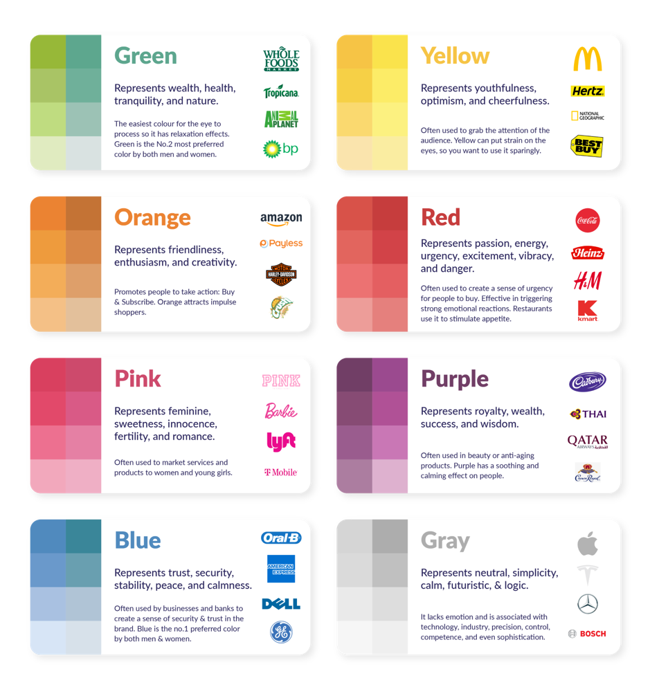
Of course, success starts with the basics. In this case, this means choosing the right primary and secondary colors to form the foundations of your palette. Primary colors, in particular, are responsible for evoking a specific emotion in your customers, so you should choose one that reflects your core values.
For example, choosing yellow (a la McDonald’s) represents cheerfulness and optimism, whereas opting for something more restrained such as gray (think Apple, Mercedes, and Tesla) promotes a futuristic air of simplicity and logic.
Your primary color will be the hue that is most used across your brand. Like the big brands below have done, using it as the main color in your logo is an ideal way to cement your brand’s image. It’ll help to solidify what your brand is about, and will trigger an emotional response in your customers from the get-go.
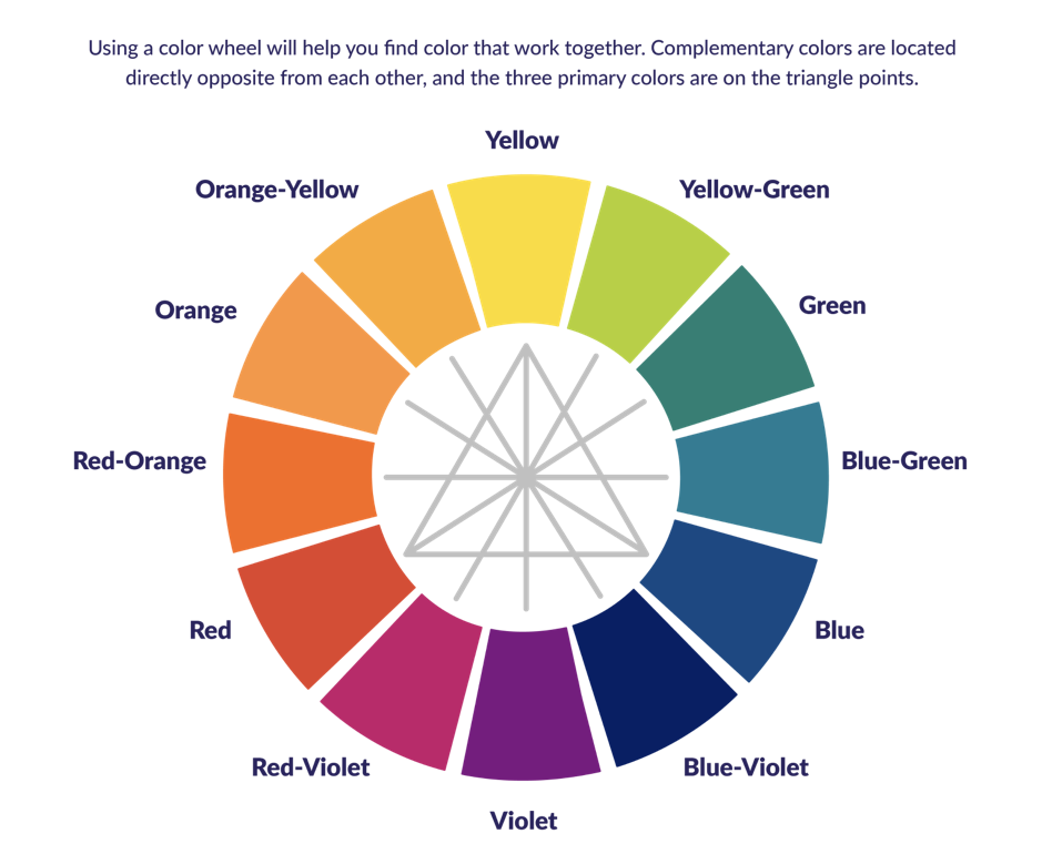
When it comes to secondary colors, it’s easier to take a more scientific approach. In the simplest terms, you want your additional colors to pop off the page, so it’s best to look at your primary color’s opposite partner, more commonly known as complementary colors.
A color wheel can help you decide which colors will have the most impact when paired together. Complementary colors are positioned directly across from each other – if your primary color is violet, for example, then your secondary color would be yellow (see the wheel below). The two contrast, so when one is set against the other, it stands out rather than fading into the background.
Top Tips for Using Your Brand Colors
Color theory doesn’t stop once you’ve made these fundamental choices, though. In fact, the work is only just beginning! Below, you’ll find some top tips on how to use your chosen brand colors throughout your website for maximum impact.
Choose a Background Color
Color plays a crucial role across your whole website, but choosing your background color is especially key. That’s because it’s going to be the most commonly used color on your website, as well as playing a large role in helping your visitors form that all-important first impression.
You have two choices. Firstly, you can use a variation of your primary color. Choosing a less saturated version will keep things consistent with the rest of your branding.
‘Saturation’ is the measure of a color’s brightness, so choosing a more muted hue will maintain the essence of your color choices, without it becoming too overwhelming.
Alternatively, if you don’t like the idea of using so much color in your background, you can go for the neutral option: off-white. This is more common and is a surefire guarantee that your content and images will stand out.
Use Contrasting Colors to Highlight Important Information
Using your chosen primary and secondary colors strategically also helps to distinguish the most important bits of information from the rest. The natural contrast of the two is ideal for pulling the eye in particular directions.
For example, if your primary color is green, you can use vibrant red to showcase your calls to action (CTAs) or emphasize key information, such as the cart button or trust signals.
Minimizing the number of colors you’re using can also help with this. Stick to two or three – otherwise, everything will be lost within a technicolor whirlwind. If your visitors can’t find your conversion points because they blend into a jungle of hues, you won’t see those coveted sale increases you’re looking for.
Adjust Color Saturation
Getting creative with your color saturation isn’t limited to your background. If you want to keep your palette consistent and reinforce either your secondary or primary colors, you can adjust the saturation when it comes to the small details, too. For example, you can use a sliding scale of similar shades for your social icons, your social media posts, and your email marketing blasts.
Saturation doesn’t only apply to single colors, either. If you want to inject more color into your branding, choosing hues with a similar level of saturation can help to keep things consistent. This crayon-box approach can also help to make your brand feel more playful.
However, if you are planning on introducing a wider variety of colors, it’s important to limit this to small areas of your website. You don’t want your pages to become too cluttered. Instead, focus this strategy on headings or infographics. That way, it won’t detract from all the hard work your primary and secondary colors are doing elsewhere.
Varying Brand Colors: Summary
Choosing and applying colors to digital design can seem overwhelming, but there’s more science behind it than you might think. The right combination of contrasting brand colors, correct saturation, and some clever placement can result in an artfully constructed brand image. Not only that, but it’ll also help you to score sales and influence purchasing decisions with minimal effort.
It’s not unusual to find color theory slightly overwhelming, but luckily, there are a handful of useful tools out there to help you. A website like Coolers is ideal if you don’t know where to begin, as it lets you select a premade palette to apply to your website, giving you a head start.