Landing page is a very significant part of your online marketing campaign, and deserves every bit of time and attention you can spend designing and tweaking it. This is where your prospects are directed when they click on your ads or look you up on a search engine. They are coming to you with a purpose, they are expecting something. So, what are you showing them?
It’s tricky; there’s not a single go-to guide that will tell you exactly how to make a high-converting landing page. The best you can hope for is a list of necessary elements; arranging them in the best possible way (that works for you) is up to you.
Now, if you have made them before, you’ll know that making landing pages takes some herculean effort and every ounce of patience you possess. Not to mention the ability to not get too attached to your design, because make no mistake, you’ll have to change and re-change it to arrive at something that works the best.
Now let’s take a look at those key elements and potential pitfalls around them. Starting with…
Content
1. The Headline
A catchy, Attention-grabbing headline is the best starting point you can have. Your attractive design is, quite frankly, going to do jack-all for your conversion goals if you don’t have a good copy. It’s the entire plot point of your novel (read: landing page) cramped in
Something you cobbled together while half-dead on your feet isn’t going to cut it.
Look at this example from ISM Market Strong:
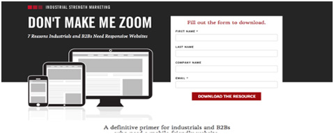
The Headline packs the 'pain punch' and Sub-headline supports it.
So make sure you:
ü Describe what the visitor gets from your page.
ü Complement/ strongly match the link that drove the visitors to your page
ü KISS: Keep It Simple, Silly.
O Don’t make it too long; use as many words as you absolutely need.
O Don’t use jargon in the headline.
2. The Subheadline
Attention has been caught, now you have to generate Interest. That’s your sub-headline’s job: to back up your headline since you can’t say everything in the largest font.
Make it count with:
ü A persuasive statement placed near the headline (above or below, your choice).
ü An extension of the headline’s message works well too.
O Don’t write a paragraph expounding upon the headline. Use your words, but keep it short.
3. The Benefits and Features
The next step is to create Desire for your product/service. And look at that, there’s no rocket-science/ witchcraft involved at all. You do this by listing your product’s features in the best possible light, by which I mean telling how beneficial it is for your users.
You can get it right if you:
ü Make your features titles’ stand out from the rest of the copy.
ü Focus on the users.
ü Make it listed. This one is a no-brainer: No-one has the patience to read through a paragraph.
O Don’t write in first-person narrative.
O Again, don’t expound (much). Stay on point.
4. The Call to Action
After you have held attention, created interest, made them want your product/service, you must now prompt them to take Action.
This is what your entire page boils down to. This button (don’t even think about not making it a button, you’re not here to preach) is what you want your visitors to do. Your validity as the creator of that landing page depends upon the number of clicks you get on that one button. Remember this: Make that button/ form visible.
You absolutely, cannot, mess it up. So:
ü Make it compelling. You have to go beyond standard CTA button-copy like ‘Submit’, or ‘Click here’.
ü Say exactly what the click does for the user. ‘Sign up to ____’ or ‘Get your free tickets’; something along those lines will work.
ü Don’t dawdle. If you have more to say, add a less obvious ‘Take the tour’ or ‘Learn more’ button, but know that it will direct attention away from your call-to-action.
5. Solid Testimonials
Unbounce’s Oli Gardner puts it well: I’ll have what she’s having. Sometimes, it’s nice to feel you’re a part of a group. That’s what testimonials do for you. They show that there are people out there who used your product/service and liked it. They are the group, and your prospect should be compelled to join them.
Shopify Plus does a stunning job with ‘Trusted by merchants all over the world’ heading for their testimonials.
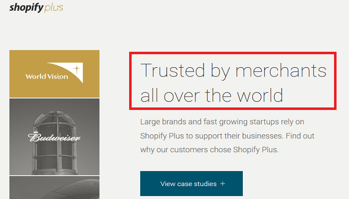
The statement “why our customers chose us” serves to reinforce their benefits.
You don’t have to create case studies. But give the visitors some solid, legit proof that your claims of satisfied clients/ customers/ that brigade you trained to fight crime, etc. are not a figment of your imagination. So:
ü Use testimonials from real people your prospects can connect with.
ü You can give the numbers of sign ups/ purchases/ followers you have (like a counter, if you’re just that popular)
ü Always, always include links (For example: Shopify Plus lets you take a look at the shops of those who vouched for the product)
ü If your numbers are low, or fake, it’s better not to include them at all. People can still make their own decisions, but a lower than expected count will disappoint them.
6. Pictures
Oh yeah, those aren’t just for decoration.
Pictures can convey your message faster than anything you have written. They are also very sneaky, so if you want a particular ‘feel’ to be attached with your product, images are your best option. Look at this beautiful example from H.Bloom.
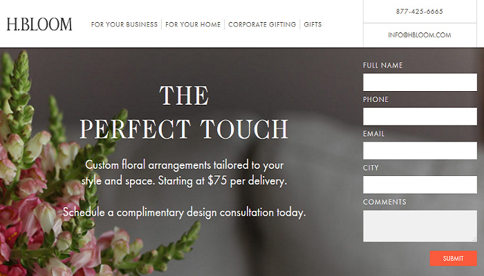
Perfect background photo that’s relevant to the service and looks lovely to boot.
You’ll still have to:
ü Use large, clear images.
ü Be relevant. If you’re selling a product, show that product or someone using it. For services, images can be attention grabbing, pleasant, and relevant.
ü Make them attractive, especially if you are using them as background.
O Don’t go for stock images. They are cliché and a last, desperate resort (for landing pages). Create your own.
O Don’t make it too flashy. Prospects will end up with a headache trying to read over background images.
Design:
I reiterate, there are no set of instructions that works best for everyone. But we still have two major design concerns that can be adequately covered, namely:
1. Short vs. Long pages
That depends entirely on your message and the logical flow.
Short pages work well when you don’t have much content. If you can compress everything in a Headline, an explanation, and CTA (picture optional), then short pages are your ticket. Note that this will work for simple, one-purpose products/ services.
The more complex ones will require hierarchy. You can break the page in smaller sections (folds) and include all previously discussed elements in the best order you can work out. Long ‘folded’ pages can also include multiple CTAs without looking too desperate.
Paddy Donnelly makes a great case against putting everything ‘above the fold’. You’ll be inclined to agree. But you can still place a CTA there, because that’s the purpose of the page.
2. Navigation
Hubspot reports how A/B testing with and without navigation yielded results which clearly show a higher rate of conversion in landing pages that didn’t include (many) external links.
Would it work for you? Frankly, it’s very likely but not entirely sure.
It makes sense to remove as many ‘outs’ as you can from landing page. I’ll say, how do you remove browser ‘back’ button? If users feel ‘locked-in’, they won’t be harboring many nice feelings for you (not for some time anyway).
The best thing in my opinion is to include a ‘Homepage’ link in your logo as a reasonable out. The rest of navigation can be safely done away with.
Testing:
This is an absolute must. You can design any number of landing pages doing everything statistically proven to be ‘right’, but if they are not getting you conversions, then something needs to be changed.
This is what I meant when I said it’s tricky and almost entirely based on trial-and-error. What worked for others may not work for you. So instead of being too presumptuous, test your page and adapt the elements until they give you the best possible outcome.
Bottom Line
All the basics listed here are not foolproof, but they should give you a good general idea of the most important elements of your landing page.
Remember: Every road leads to this. The landing page is the most important tool in your online marketing arsenal. You cannot, in any case, screw it up. You will also not get it right in your first try every time.
So create, test, and modify like lather, rinse, repeat.
It’s how you improve.